La Banquise
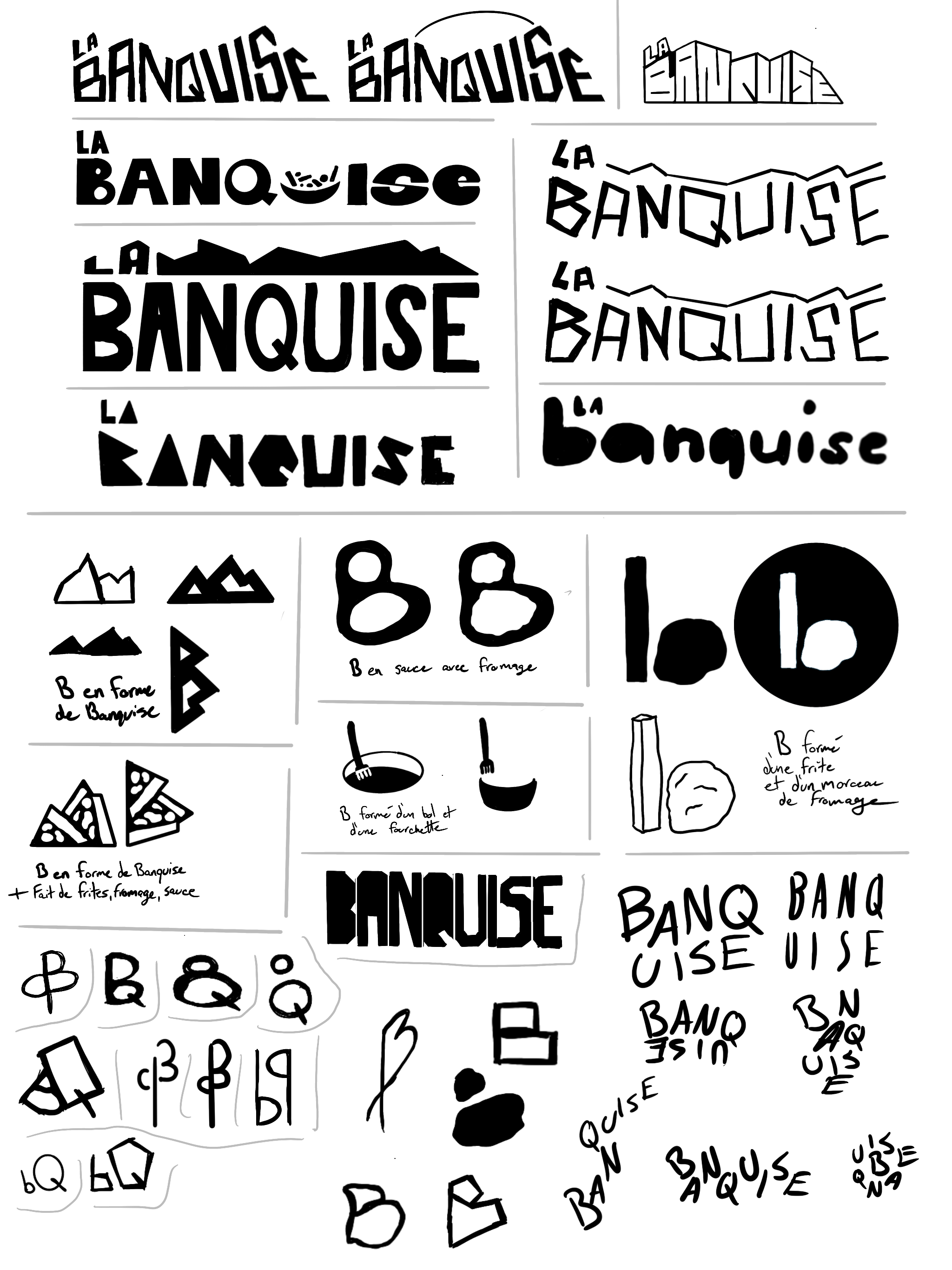
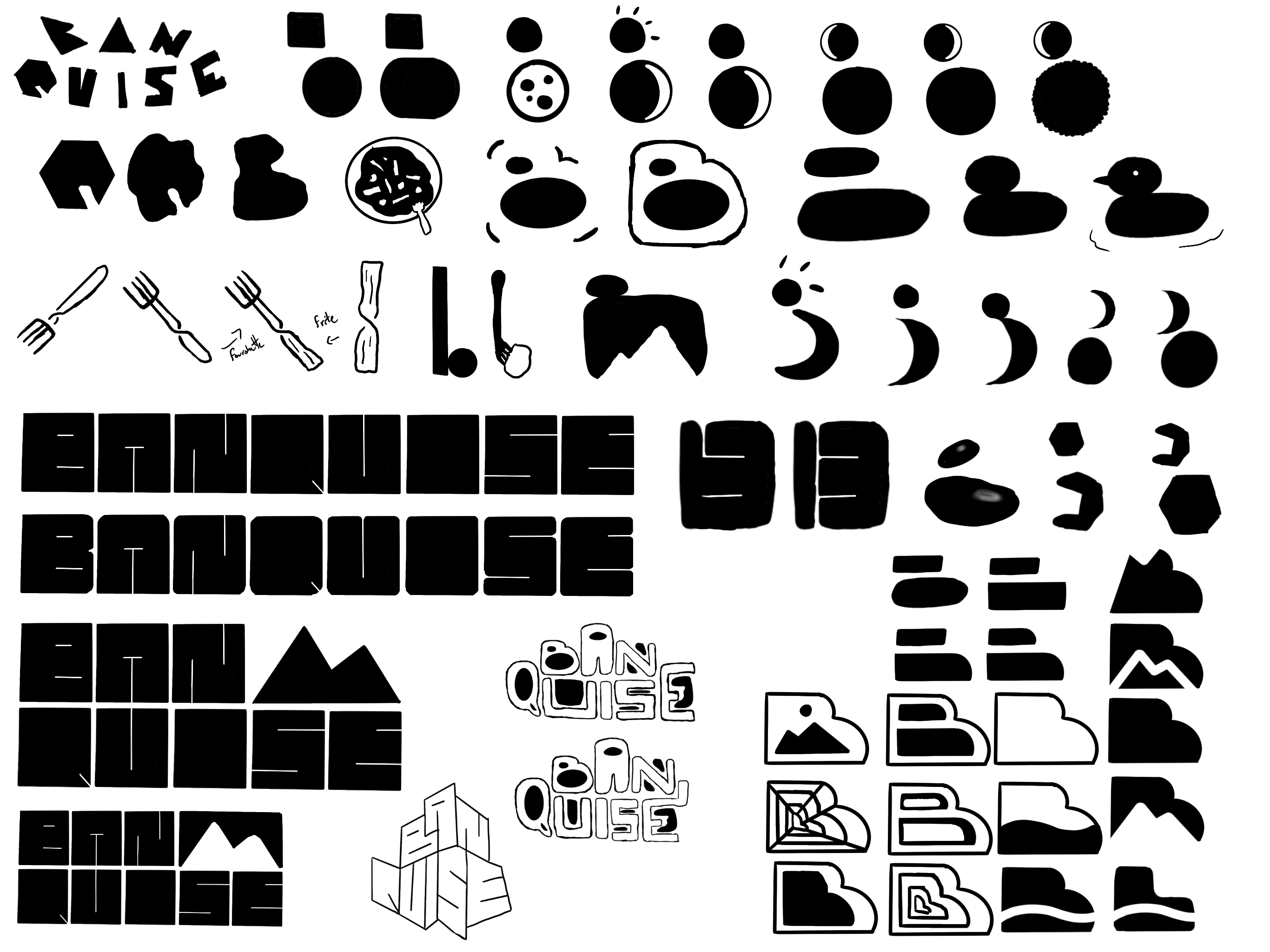
Banquise, the famed Montréal restaurant is rebranding! (Not really! This is all part of a college project exploring rebranding local brands!) The current branding used by the restaurant no longer represents the brand as it is today. By its use of a fantasy and playful font in it's logotype, it doesn't fit the visual universe and the general ambiance of the restaurant. For my redesign, I wanted to better focus on the target audience that is young, with a unique and exciting branding, with hard spikes and a unique font. I thus worked through multiple sketchesto find diverses ways to express the values of the restaurant and the new energy of the new branding.
Sketches
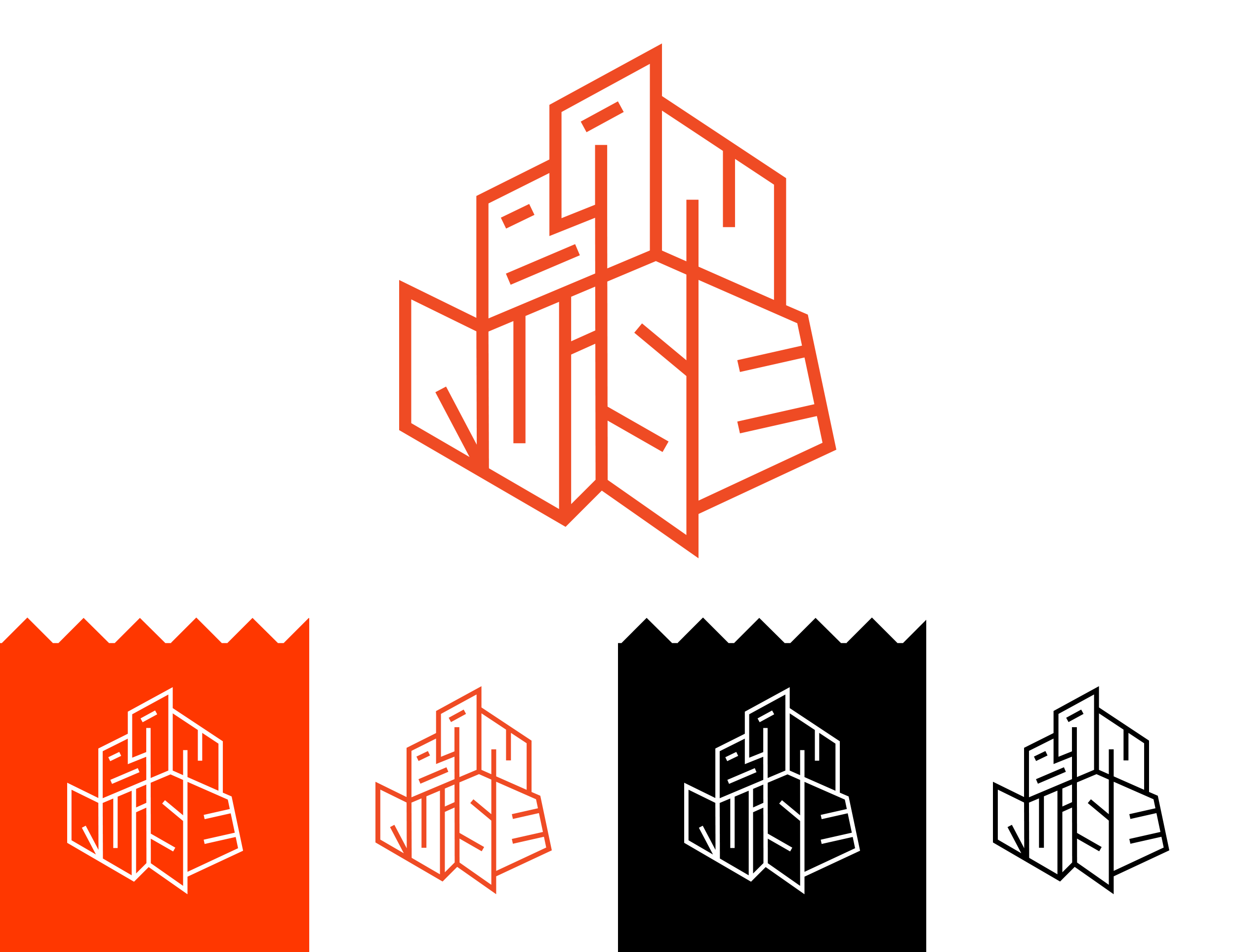
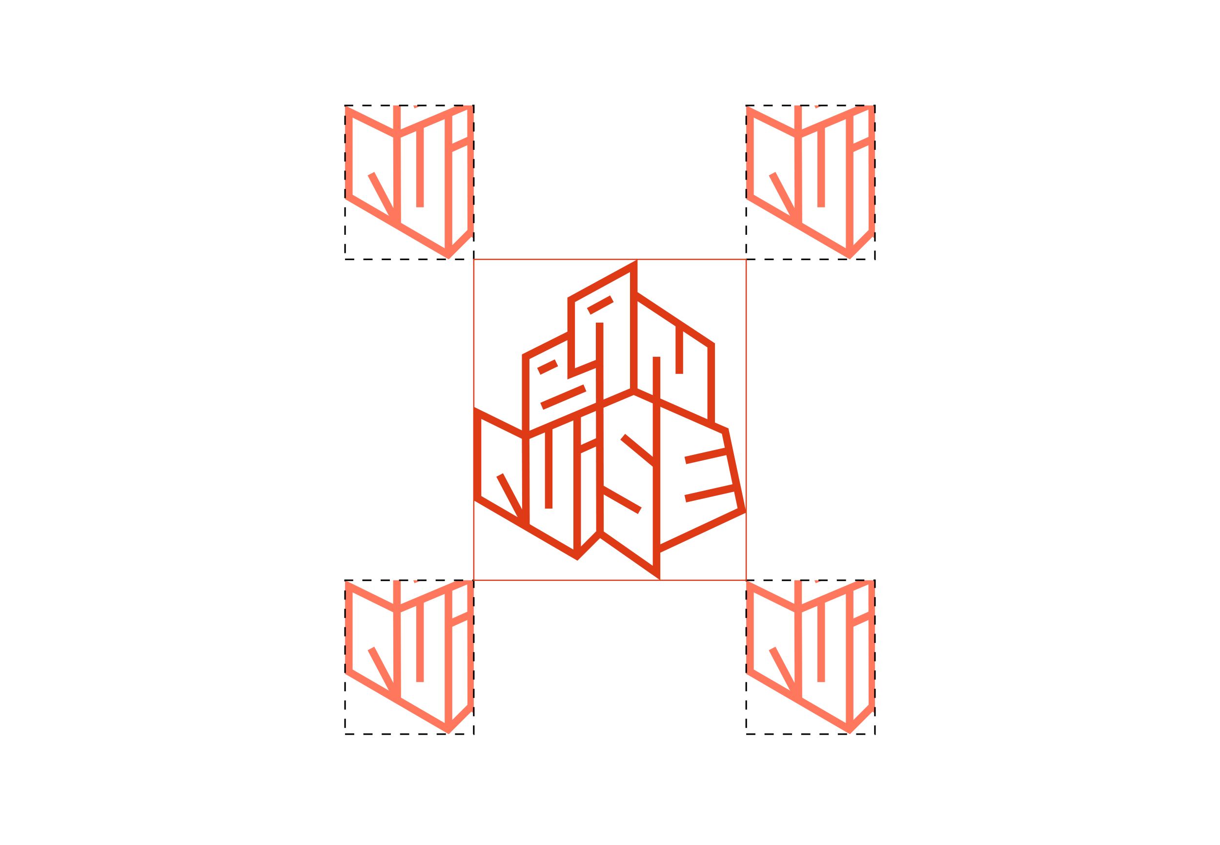
Final Branding
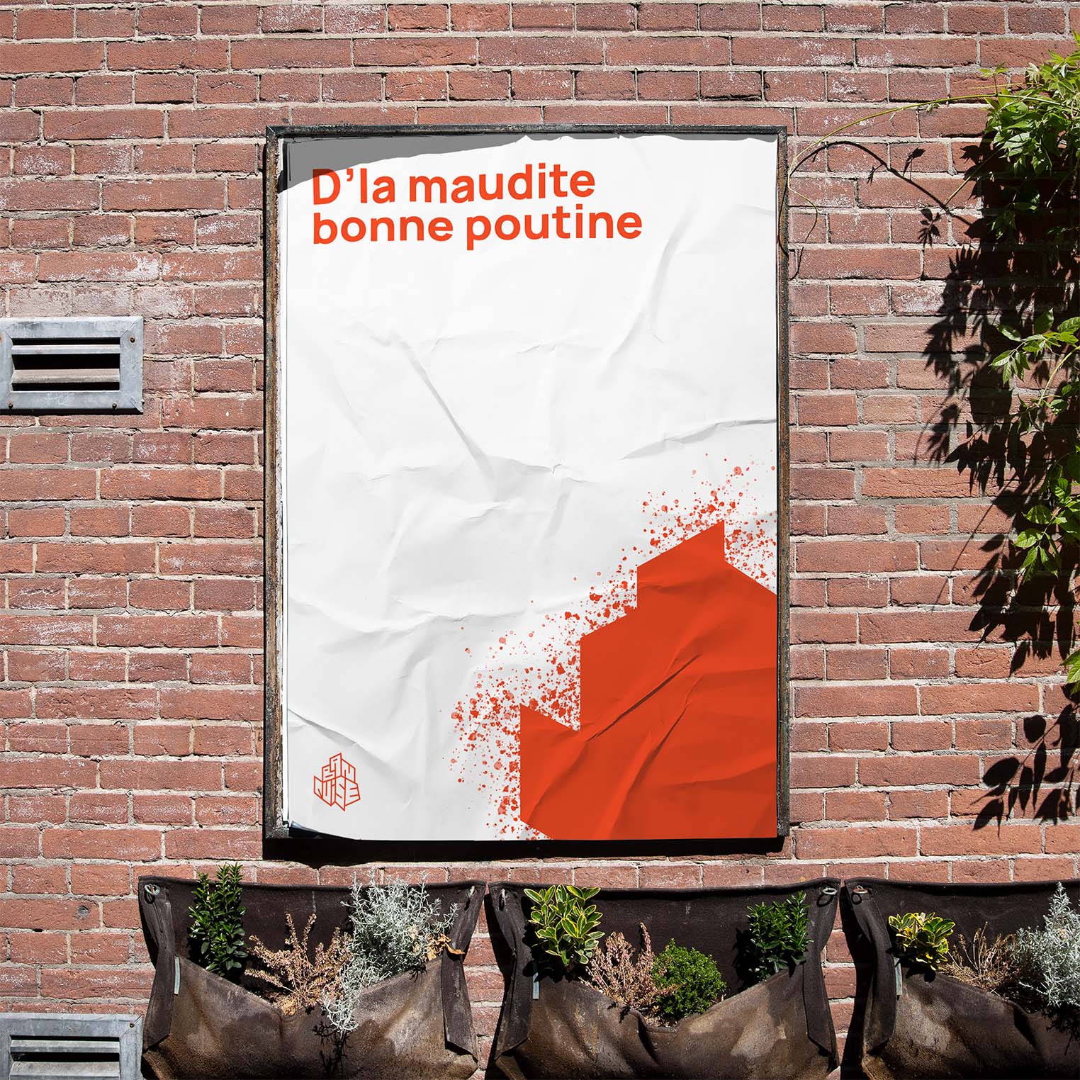
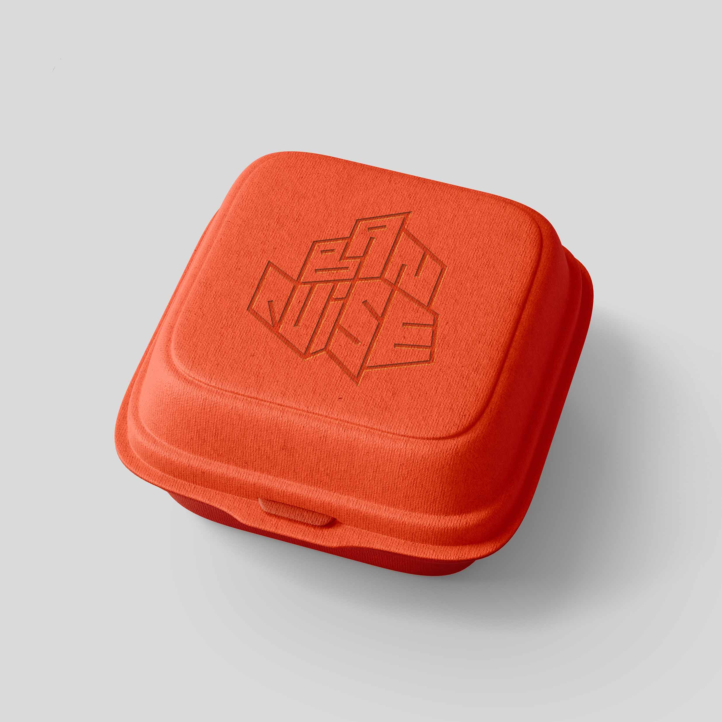
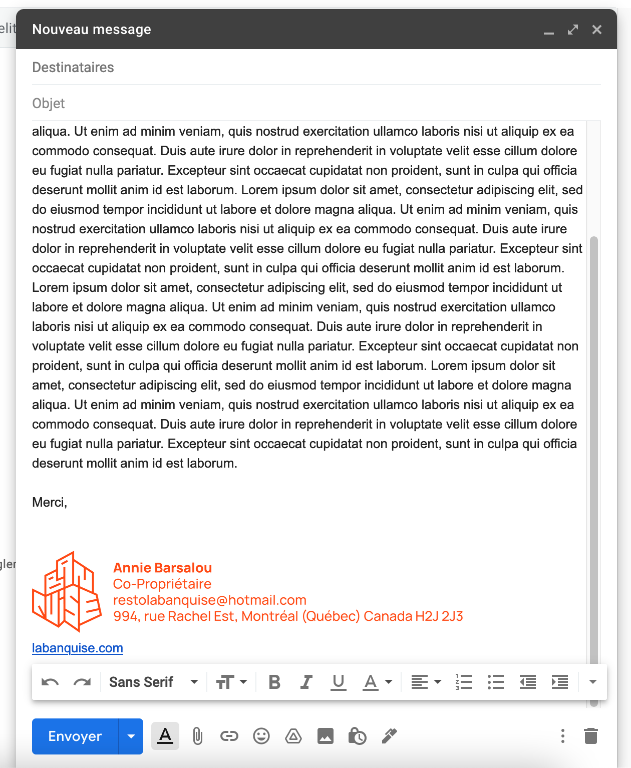
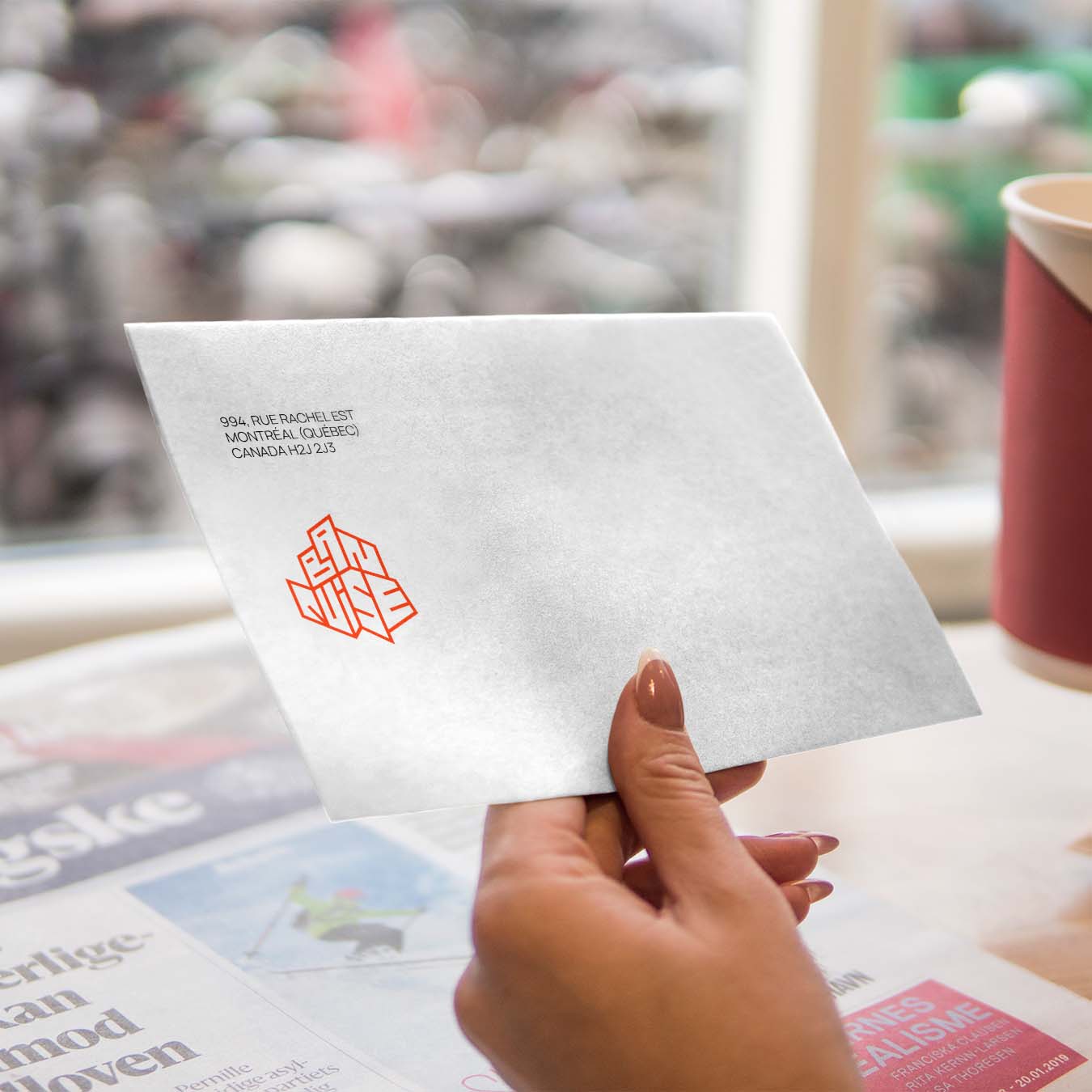
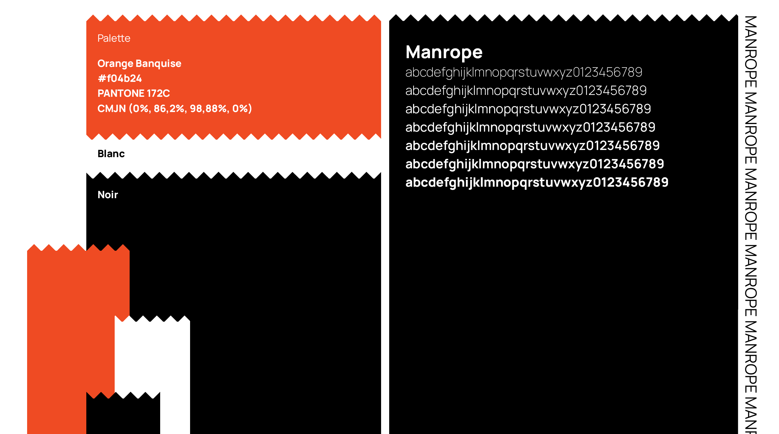
Ultimately, I chose a branding made with sharp angles and an exciting color that reflects the crazy spirit of the restaurant. Its use of a red-orange captivates the eye and keeps it interested on the new branding. The new graphic style that is angular is young and modern. This rejuvenation of the brand thus works better for the target audience that are young adults that visit the restaurant.
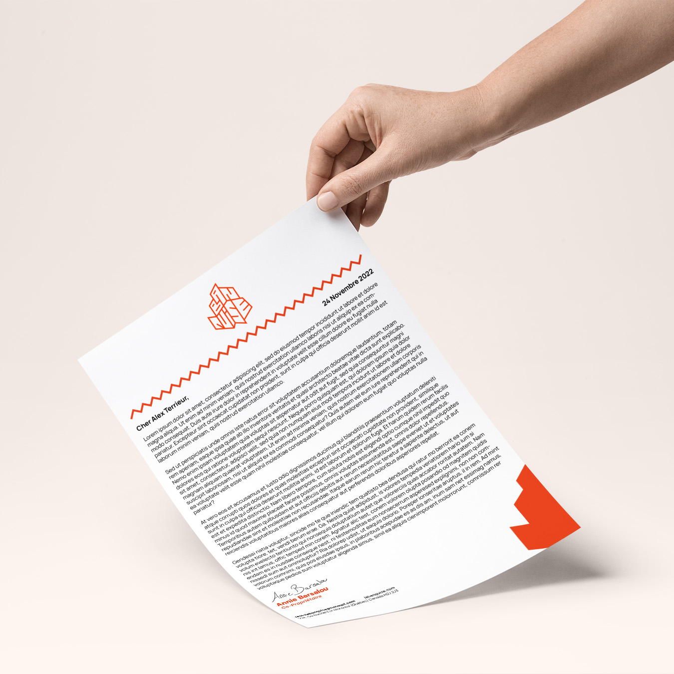
Mockups