Frenemies
This personal project was a fan concept for a Visual Identity Rebrand for the H3 Frenemies Podcast.
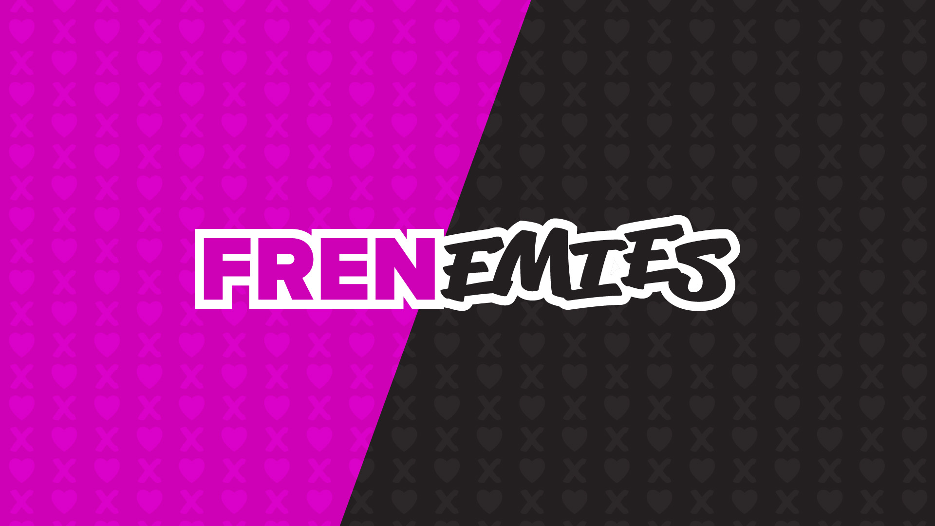
New Logo
With this redesign, I wanted to create a cleaner and more consistent logo for the podcast. I changed the fonts to reflect the adversarial environnement that is typically captured in this podcast. I chose a simple sans serif font for the “FREN“ for a friendlier typeface and a marker-like font for “EMIES“ to show the oppositional side of the podcast. On top of that, I picked pink and black to reflect the colors of the set. This creates a visual consistency across the podcast, and displays the contrast between the two sides of the podcast perfectly.
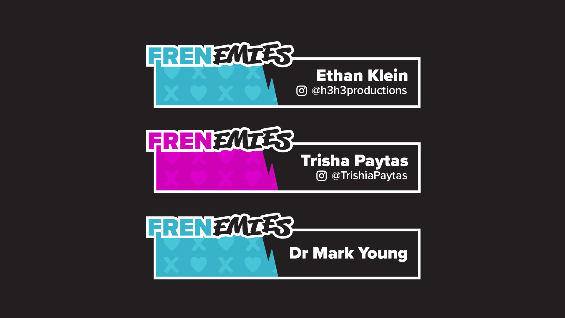
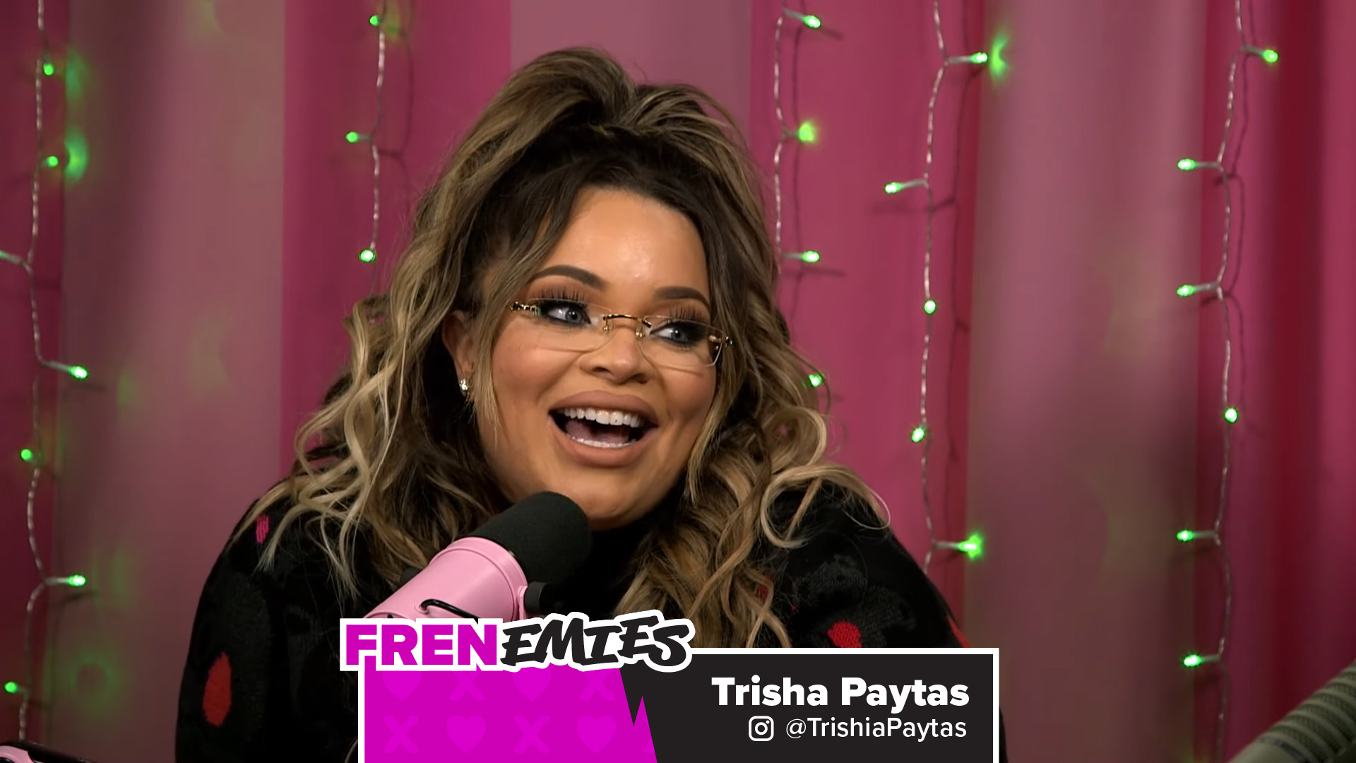
TitleCards
This new visual identity can be used in this new titlecard concept. The colored inside of the “FREN” part of the logo can switch between pink and blue, depending on the person presented by said titlecard.
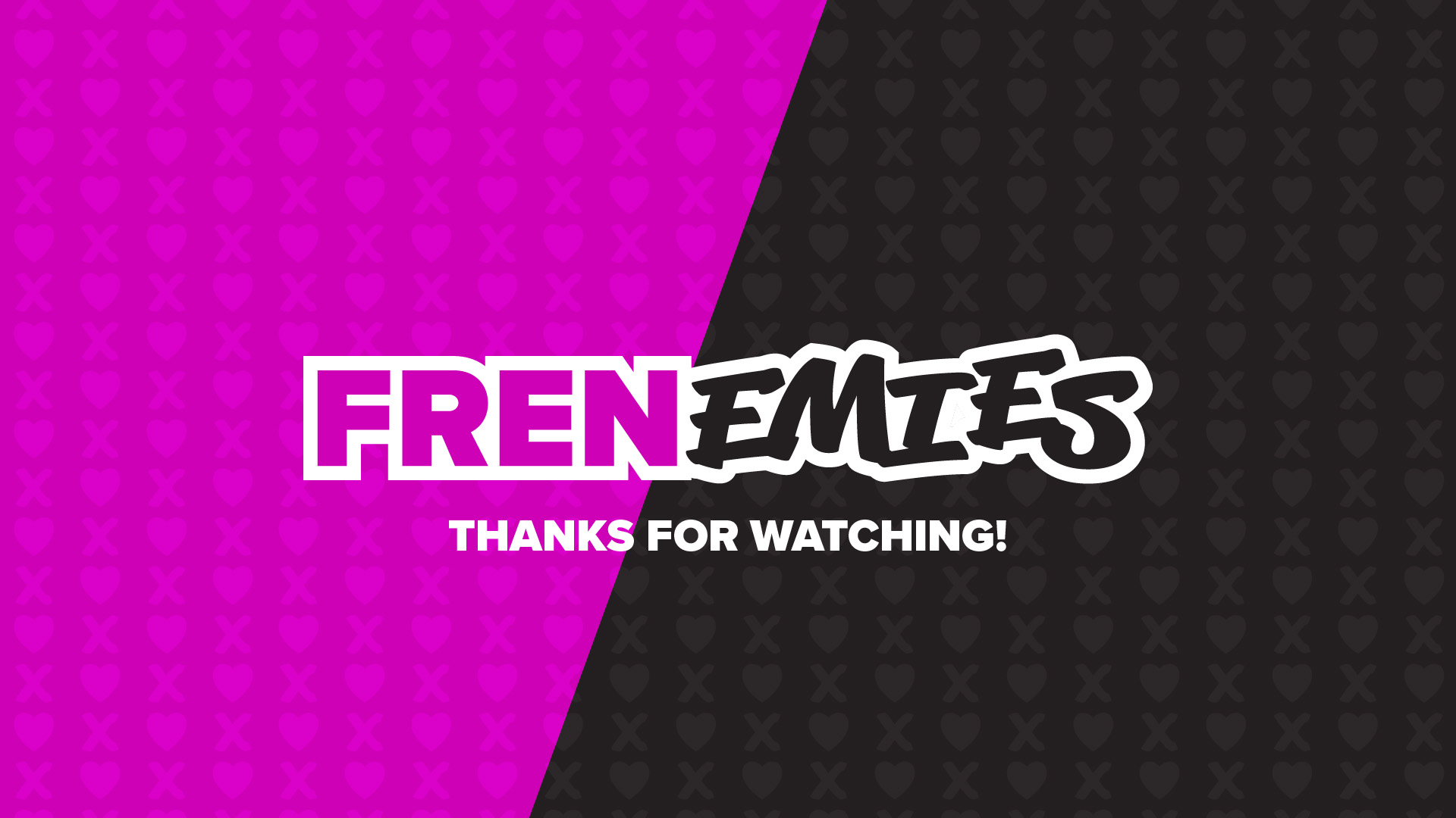
Background & End Screen
I also created a background that would be used during intermissions and/or during the end screen sequence of the podcast, creating a uniform look for the podcast.