RIDM - 25th Edition Branding
NOTE: This project was created in a school context and isn't representative of their branding nor is it approved by RIDM.
Brief
Since 1998, RIDM has been an international festival aimed at sharing and showcasing various engaged and independent documentaries from around the world, making them accessible to everyone. The festival also aims to offer a meeting place for filmmakers who come to appreciate the event. Their artistic, social, engaged, and independent programming attracts a diverse audience of filmmakers, enthusiasts, and other culture fans. However, the audience is predominantly composed of French speakers, particularly from Montreal, and nearly a third of this audience falls within the age range of 24 to 34 years. Festival-goers tend to return for several editions, so it is important that the brand image is recognizable.
Analysis of their current branding
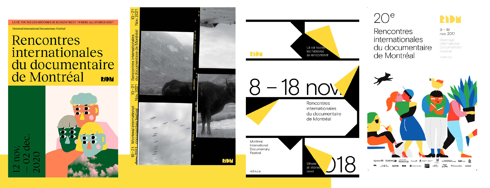
RIDM currently uses a very modern brand image. They heavily utilize their signature yellow color and tend to use many geometric shapes, sometimes moving towards simple vector illustrations or photography. They keep their posters simple and effective, straight to the point, while still being stylish and bold. It is important to note that festival-goers return to the festival multiple times, so it is crucial to have a visual style and brand image that is recognizable to those already interested in the event.
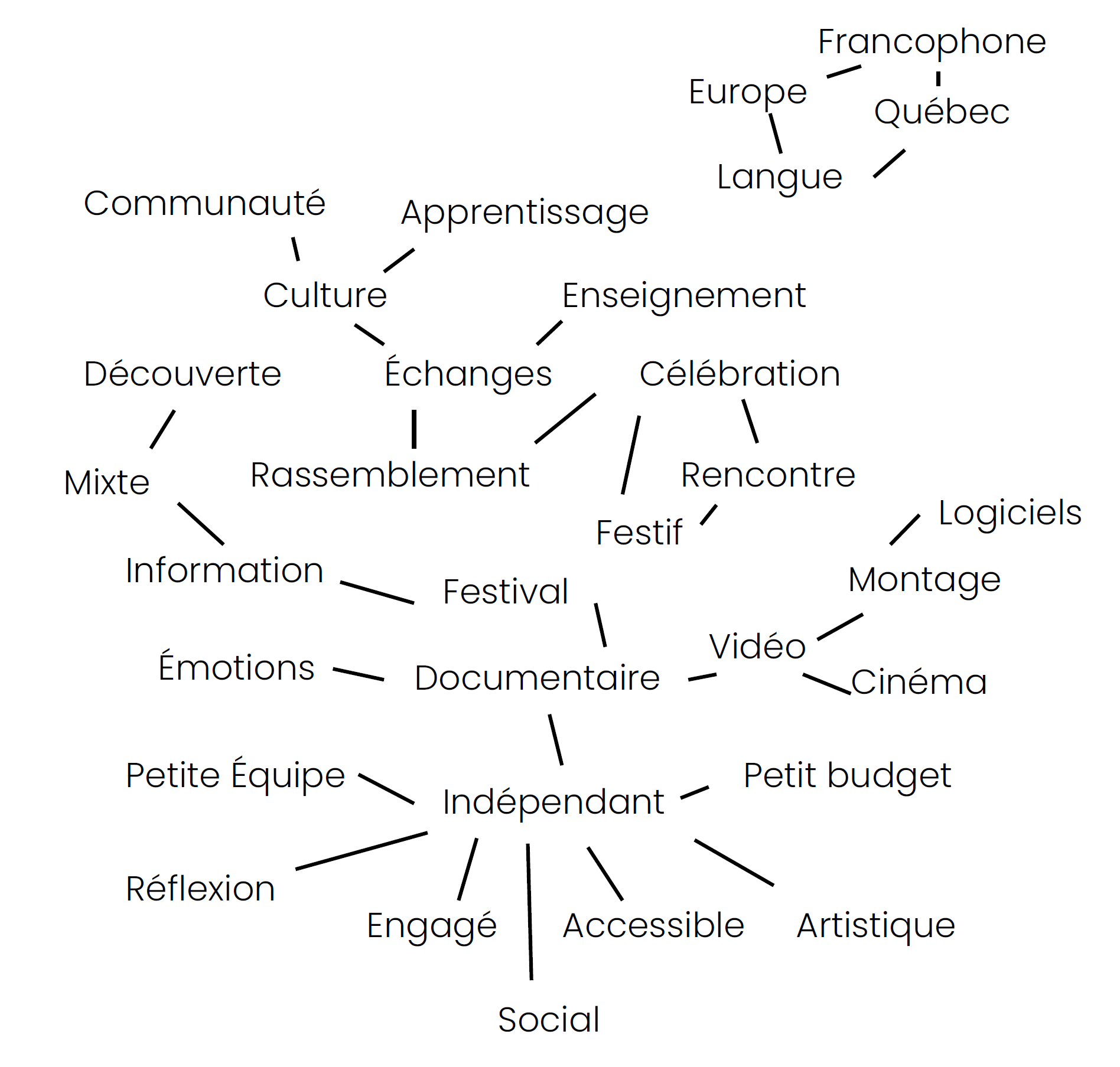
Keywords: • Meetings • Reflection • Engaged • Accessible • 25 years
The Plan
"Other film and documentary festivals seem to fall more into clichés. Whereas RIDM creates its own visual universe, other festivals seem to fall into the cliché of recurring and recognizable elements of cinema (camera, film, popcorn, cinema, etc.), creating redundancy and a lack of originality that makes these posters indistinguishable from others. What I want to create with my visual concepts is to connect to the visual universe of RIDM while standing out with my originality. I was thinking of going towards a graphic style, either photographic or illustrative, leaning towards texture and vector. I didn't focus on typography as a concept for this project. I wanted to create a creative, unique atmosphere that conveys a message of discovery, sharing, and accessibility to the festival. I used RIDM's yellow, but I was not afraid to explore more festive and exuberant colors.
Brainstorm
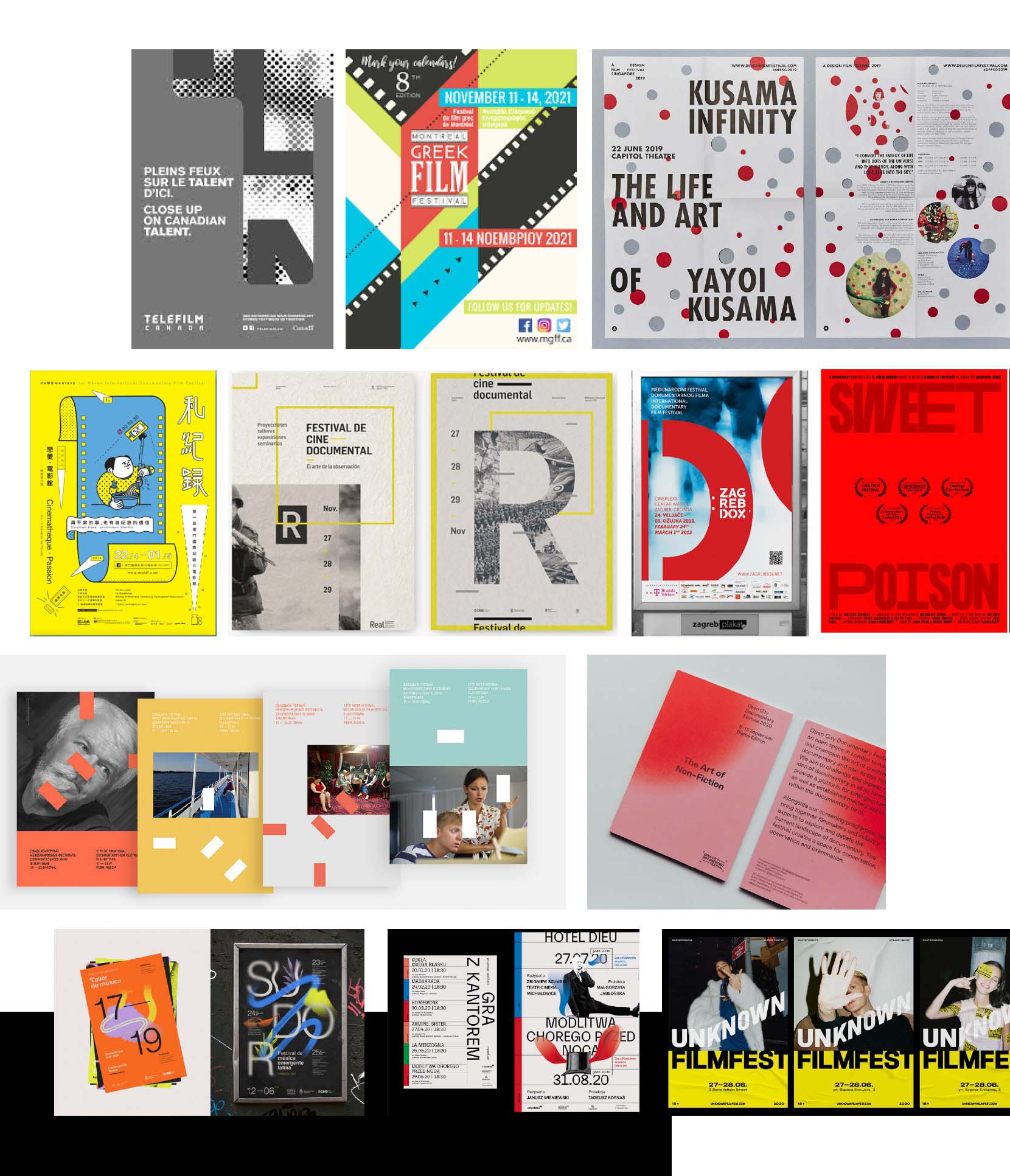
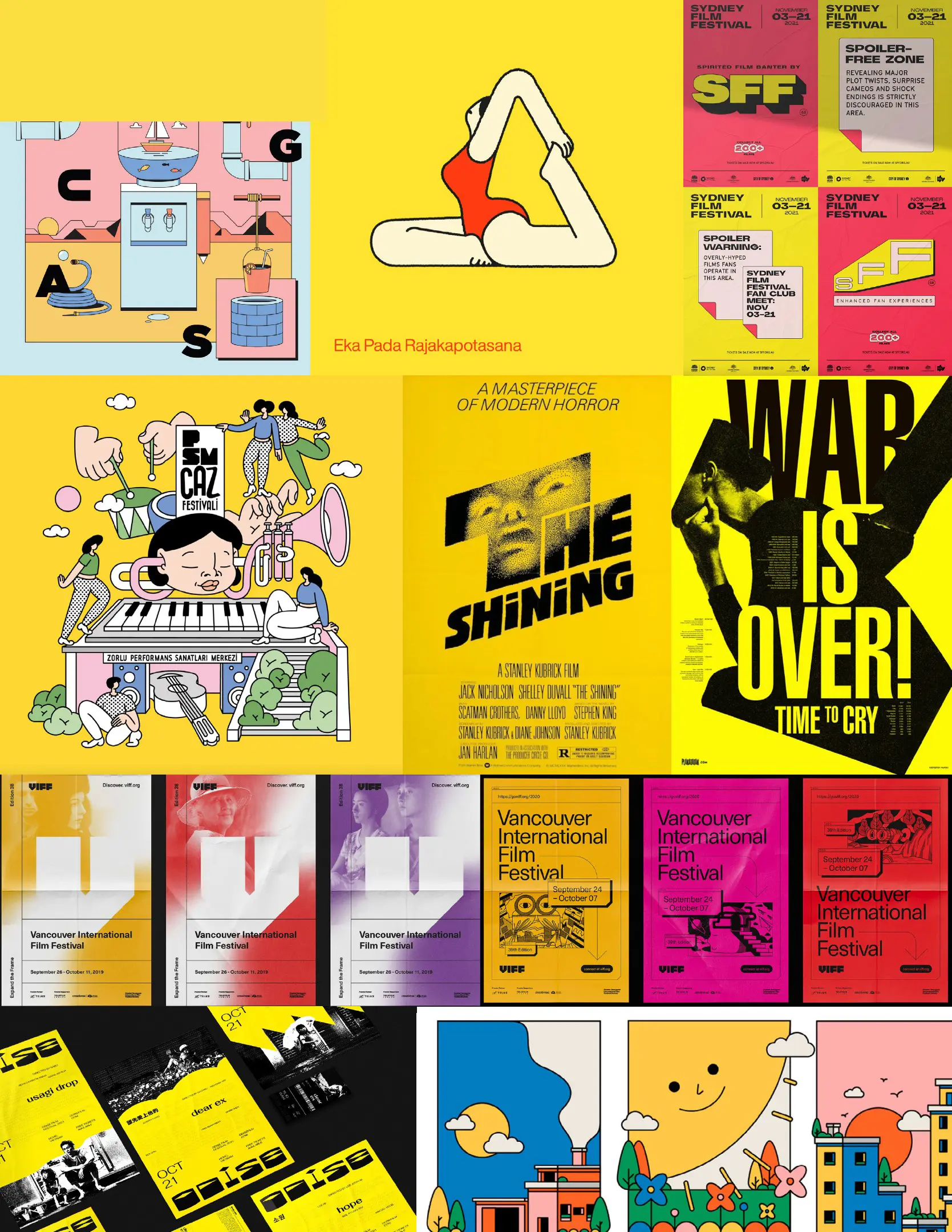
Visual Research & Moodboard
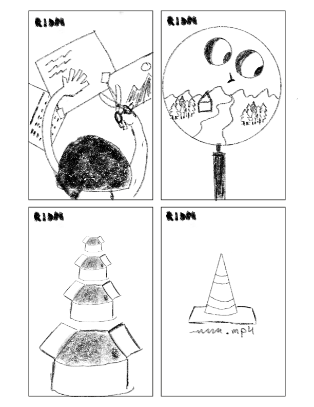
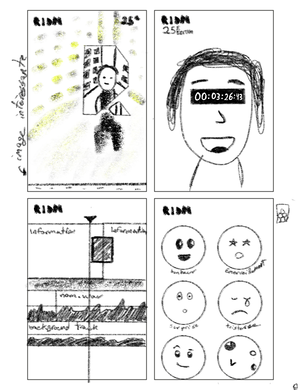
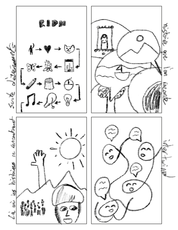
Main Concept & Poster Design Sketches
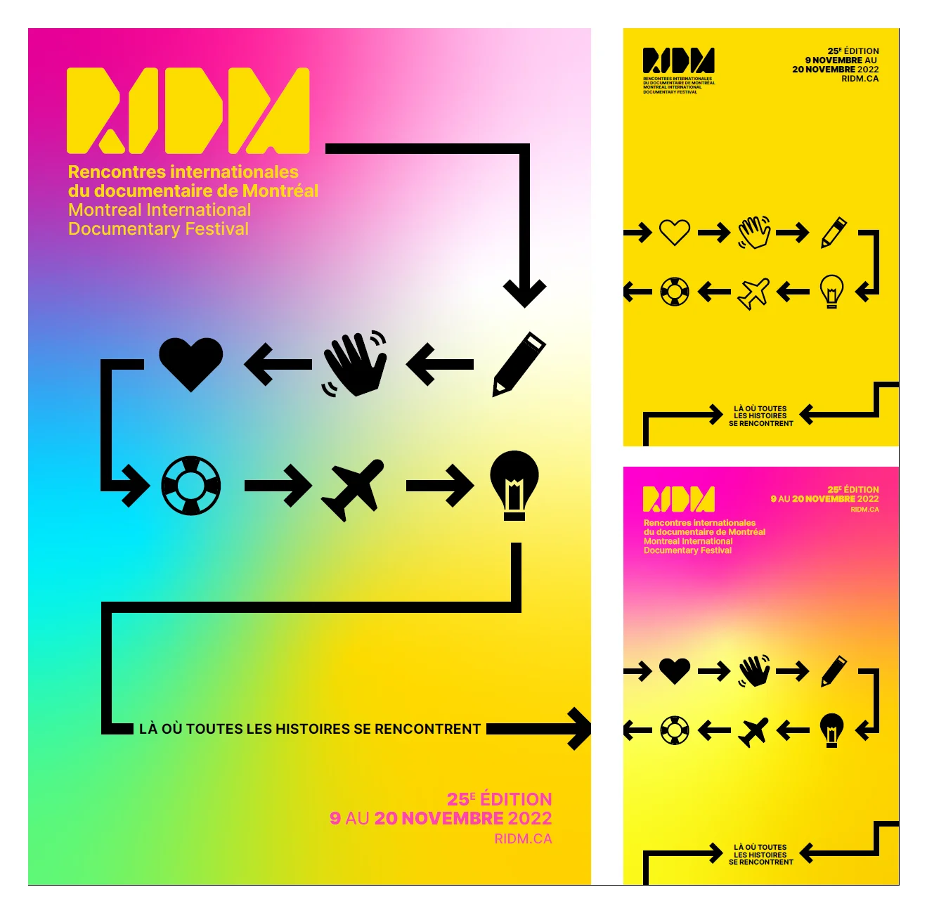
Proposition #1
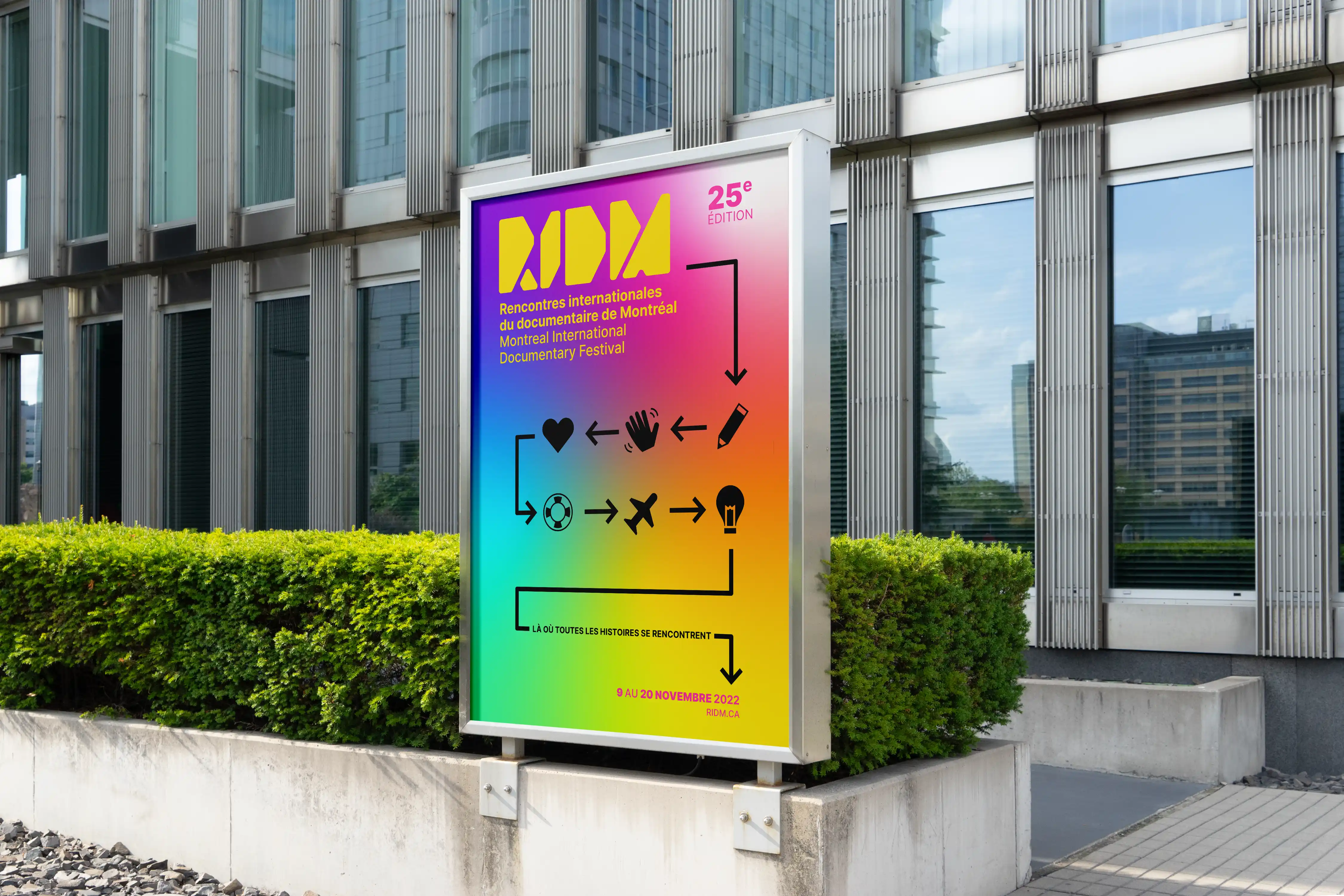
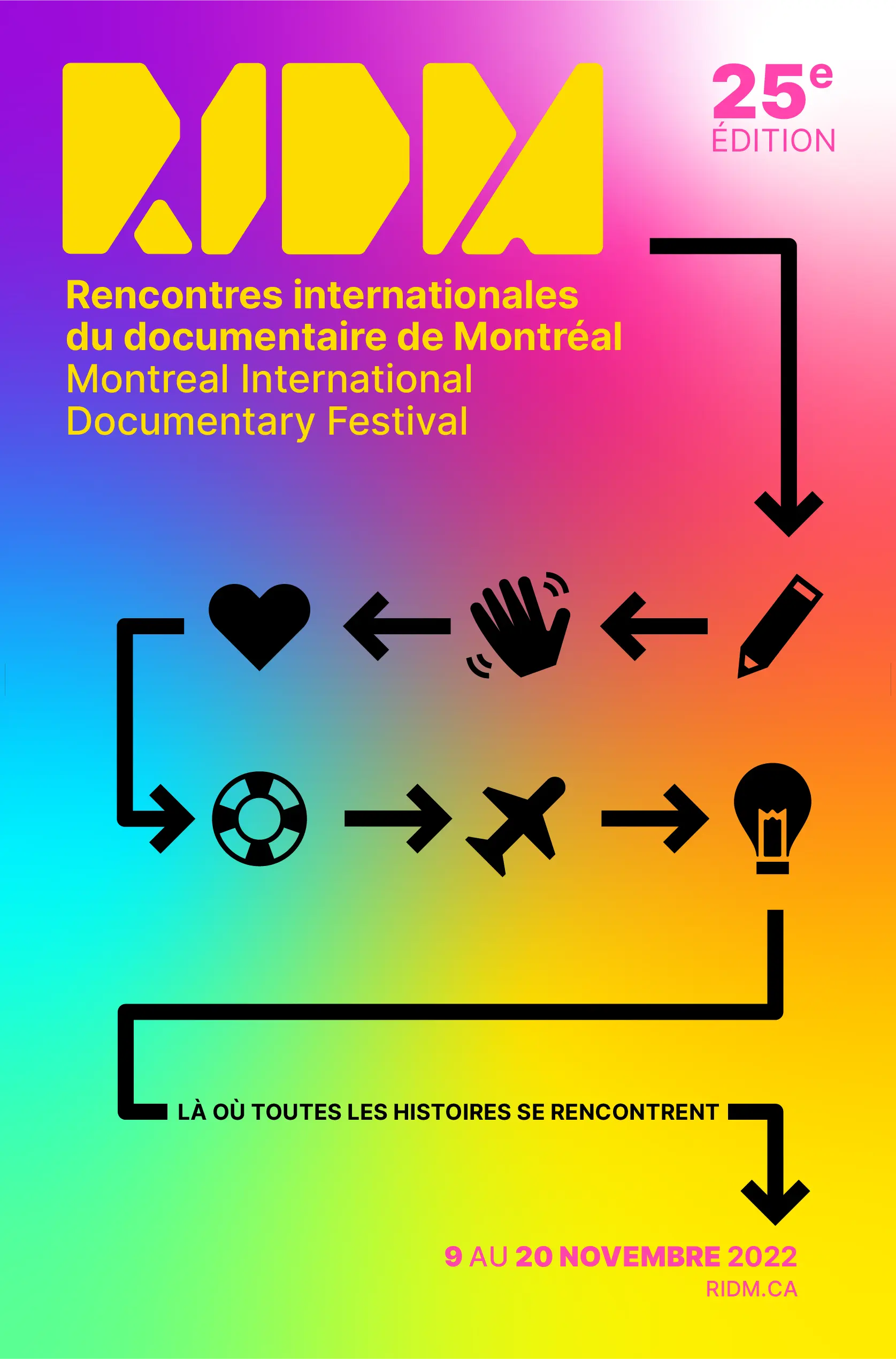
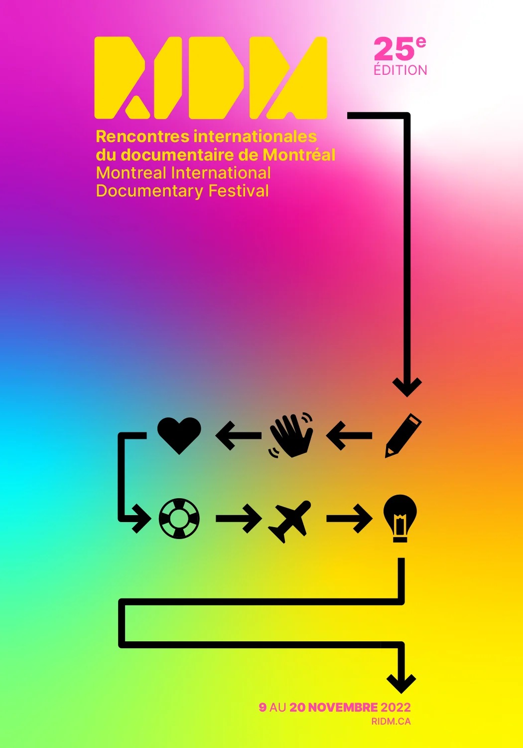
This poster concept represents the story, the screenplay, and the events. Indeed, a story can be broken up into a sequence of events, and this series of pictograms perfectly represents this visualization. The guiding line, which starts from the festival, leads us to a series of pictograms, each representing a larger concept. When a passerby sees this poster, they can see a multitude of different stories since the pictograms can represent a variety of different situations depending on what they imagine. The guiding line of the poster, along with the gradient and the pictograms, are also very easily adaptable to each of the signage, themes, and other iconographic needs of the event.
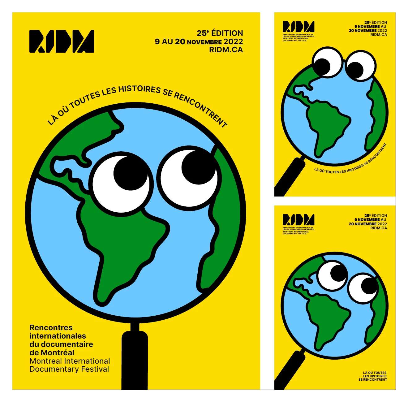
Proposition #2
This proposal depicts a magnifying glass that enlarges the planet Earth. It represents a global view of diverse stories from around the world. We play on the preconception that a magnifying glass normally enlarges the subjects behind it, but here it gives us a global perspective. Pure colors, relevant to the mandate, are used and lend themselves to a simple and modern illustration, making the poster approachable to everyone. The innocence of the 'heart of gold' graphic treatment also demonstrates openness to the world and the discovery of all the stories that documentaries can show us. The sans-serif typography gives the poster a serious and thoughtful air, pulling it away from a childish look and towards meeting and discovery.
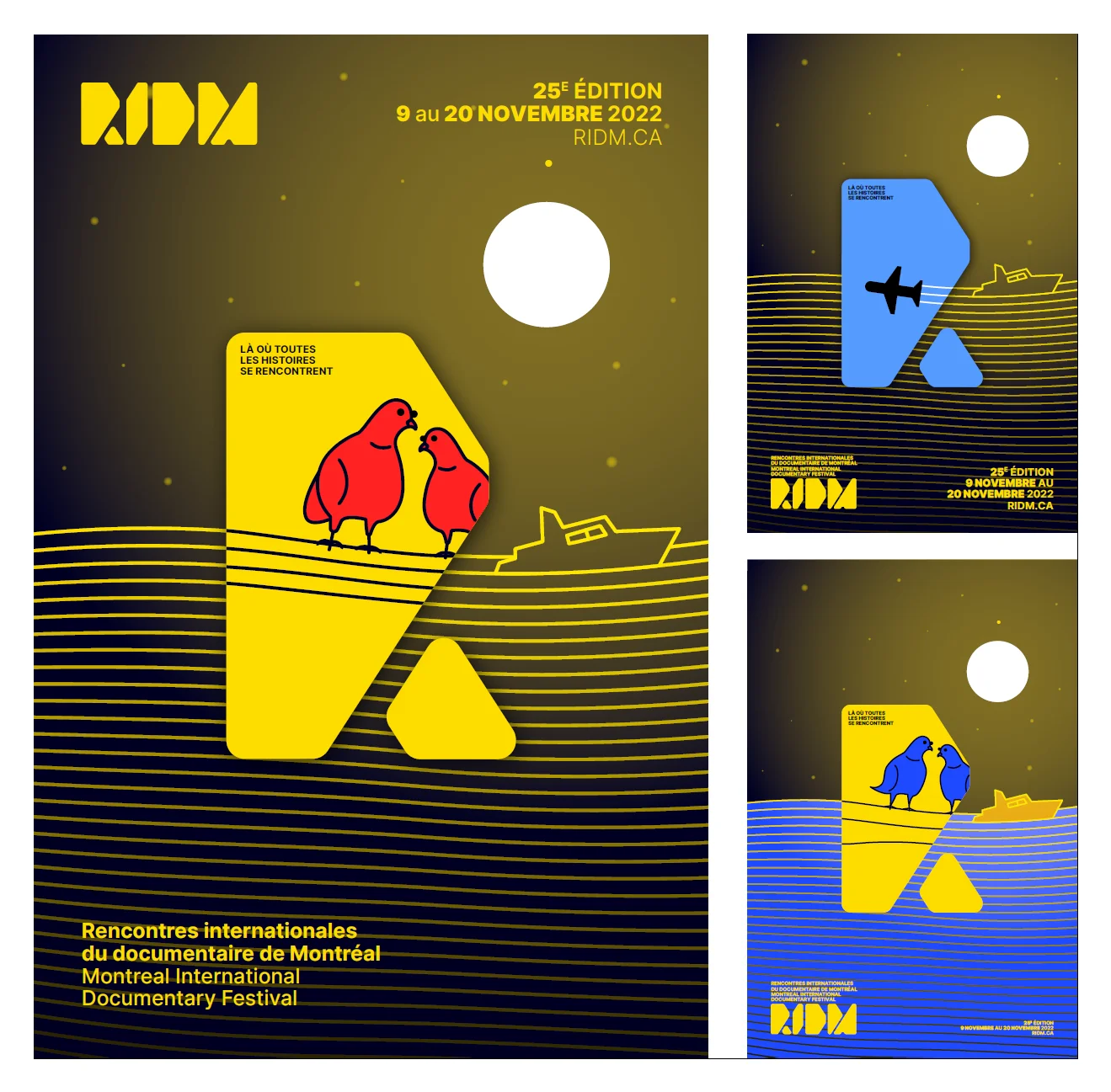
Proposition #3
This concept represents the meeting of two stories that are linked with connecting lines. Here, we depict two stories, two different points of view, using the counter form of the "R" from the RIDM logo. This shows us that the festival helps in discovering diverse stories that converge at the event. The waves of documentaries on which the boat sails transform into electric wires on which two pigeons rest. This unification reinforces the festival's slogan, which successfully creates a meeting point for multiple stories.
Final Poster
Ultimately, I decided on moving forward with Concept #1, since it gave me the best path forward to having an adaptable branding and visual design that I could easily reuse and modify depending on where it would be used.
Variation Sketches
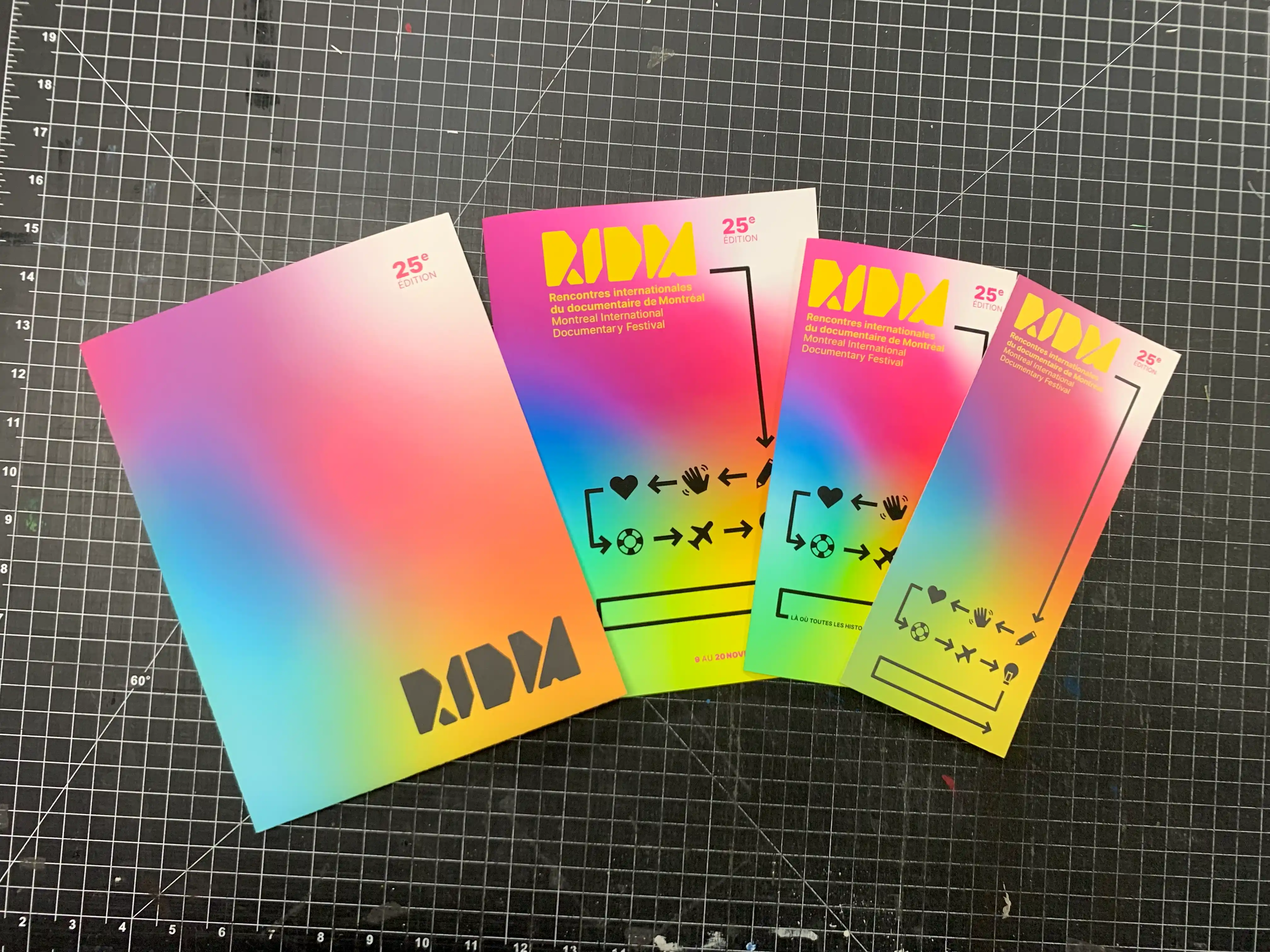
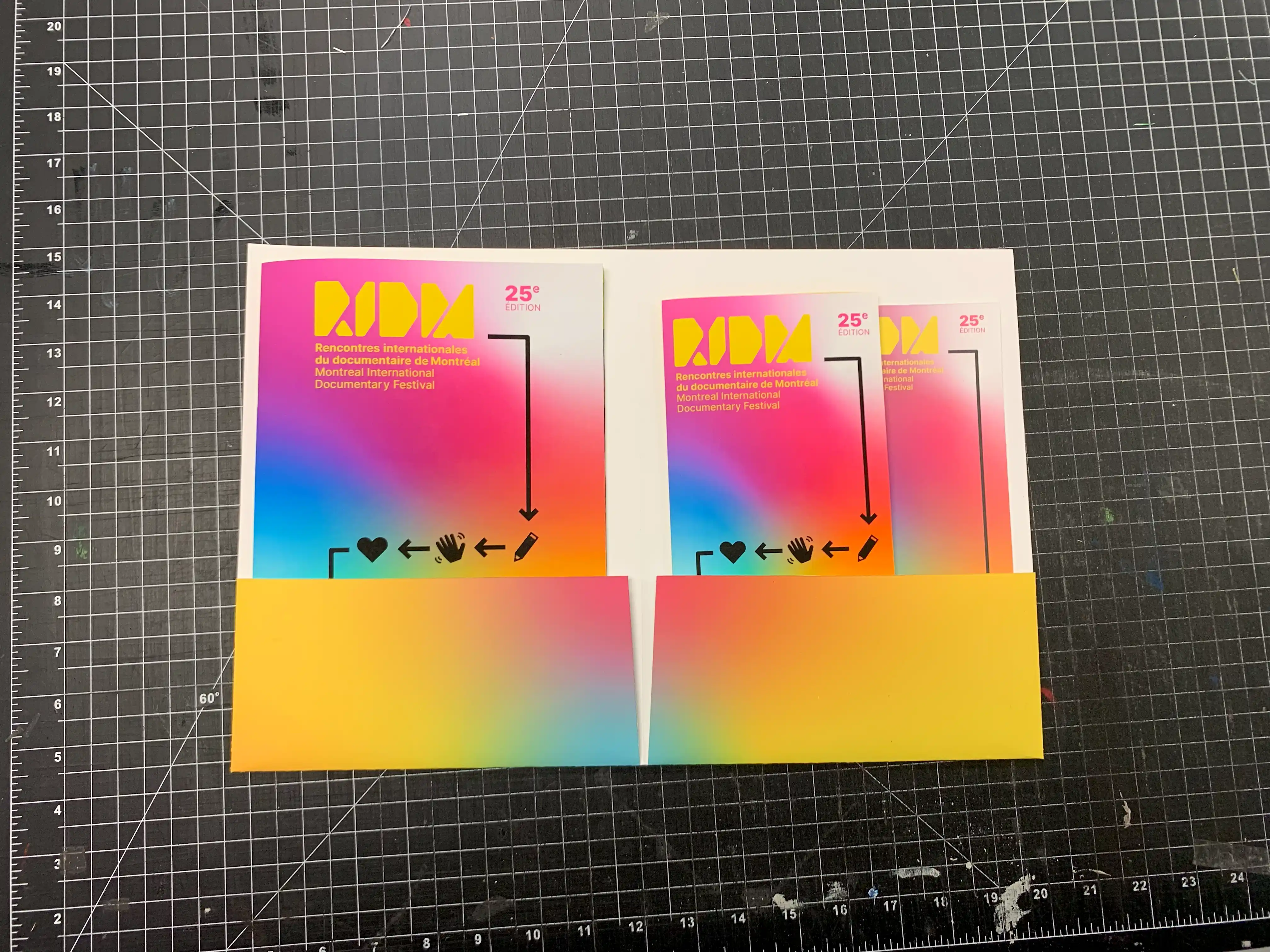
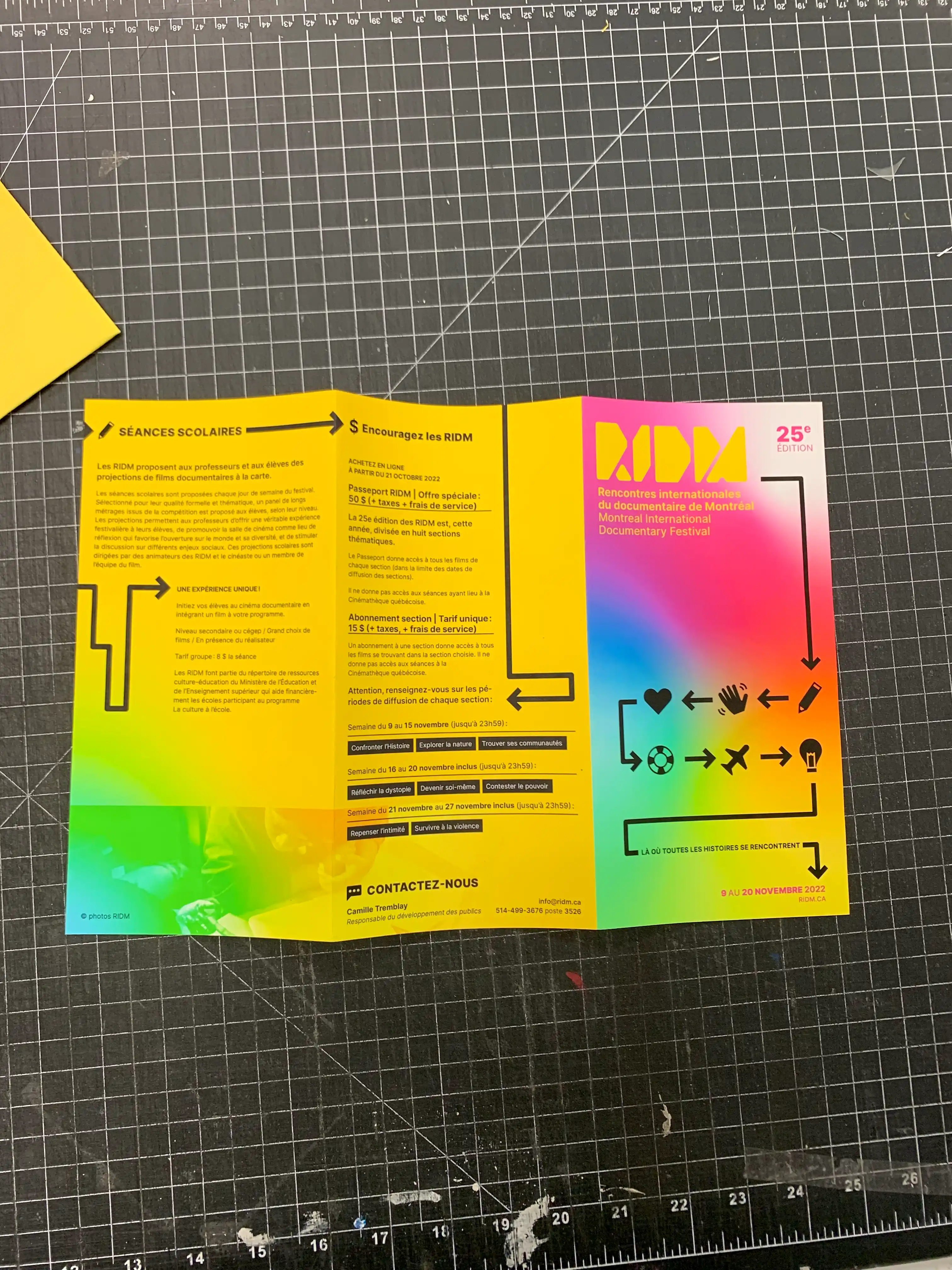
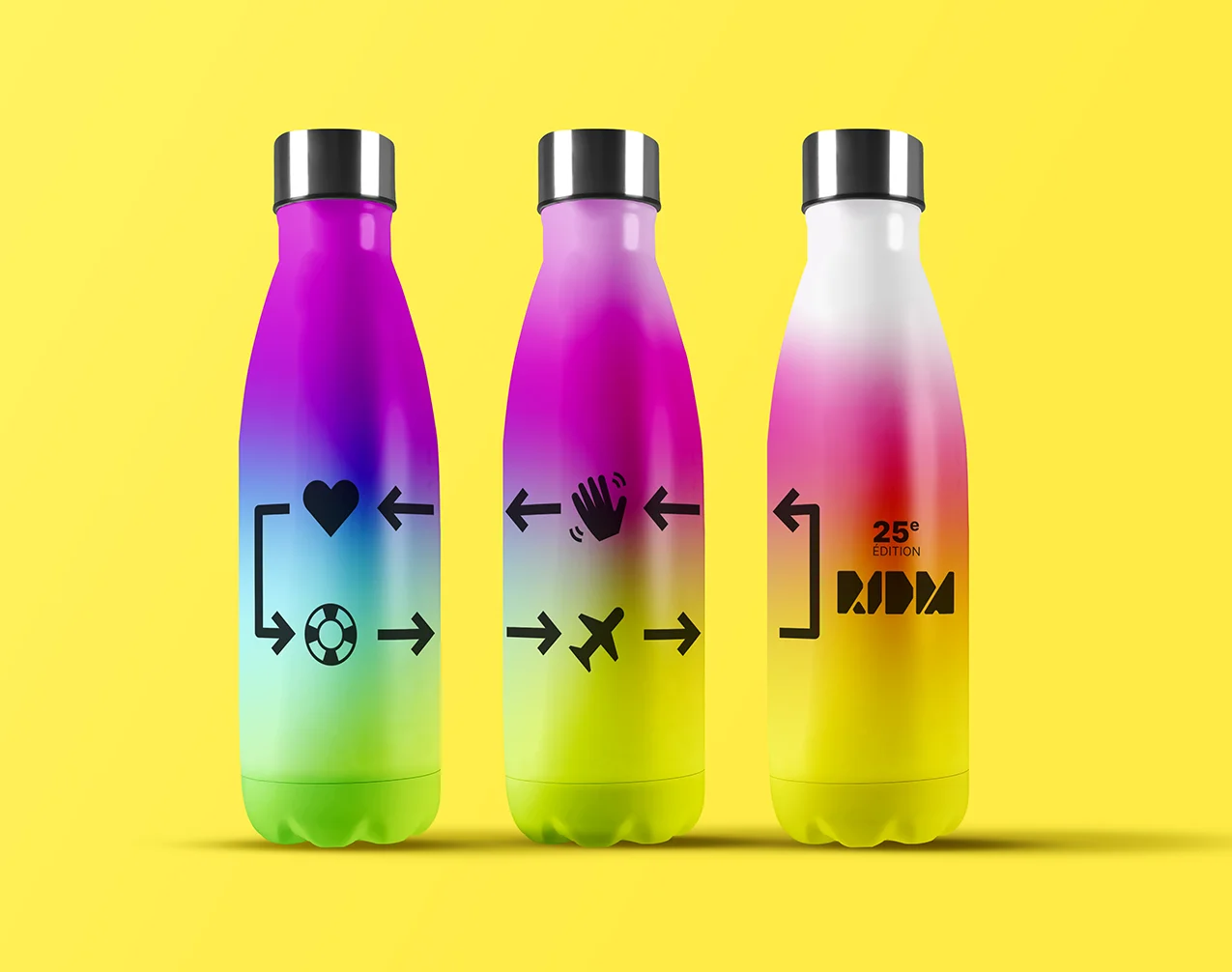
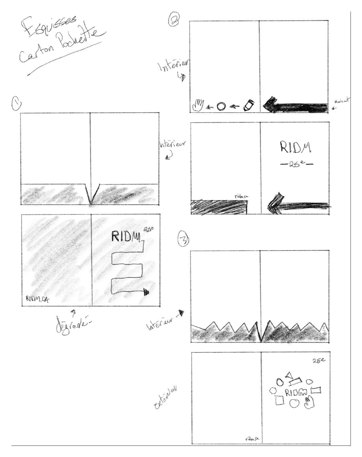
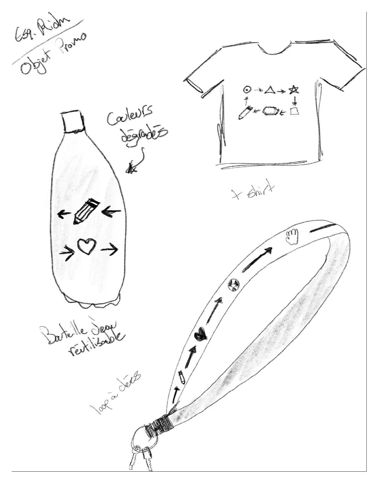
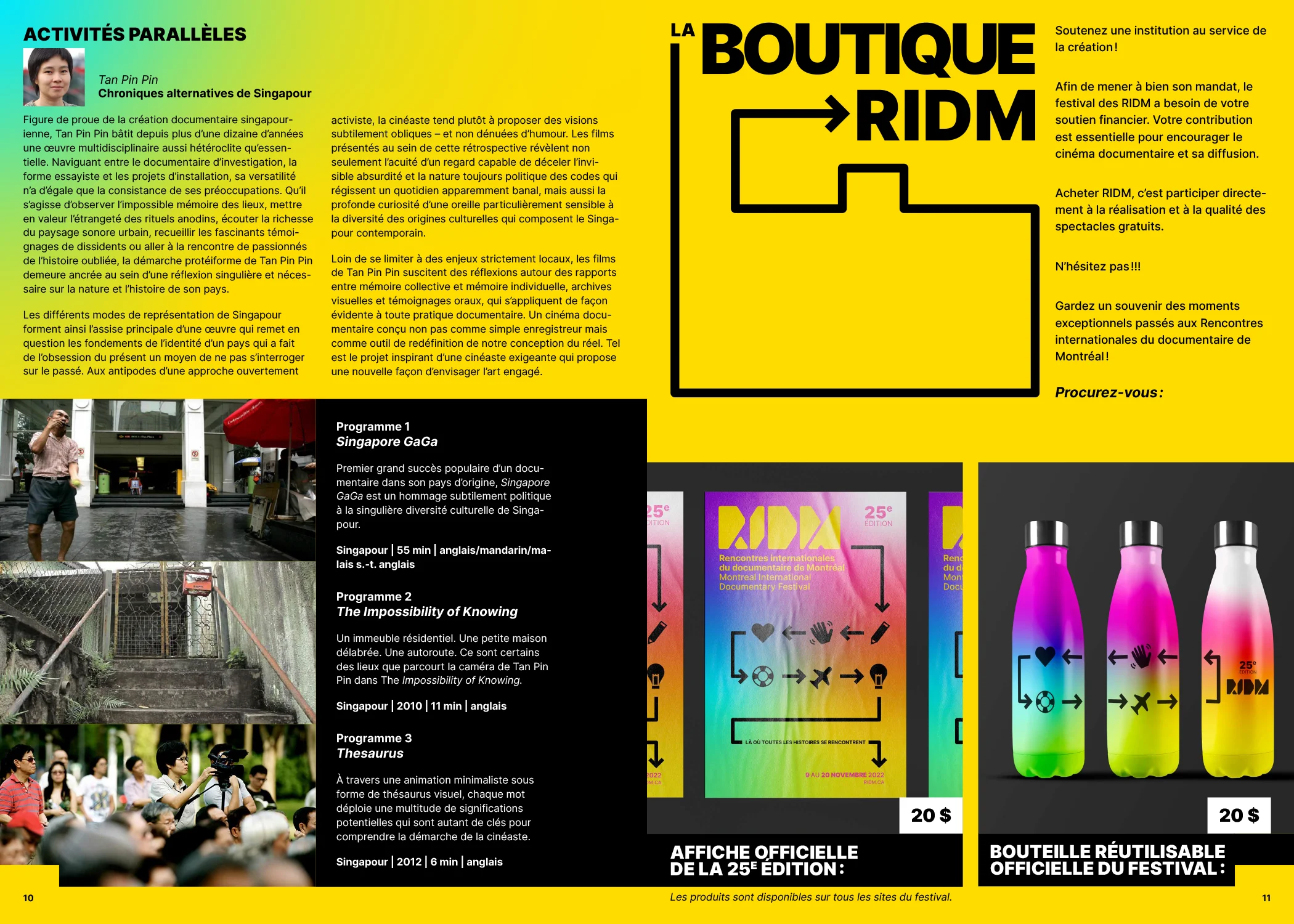
Now that the branding is set in stone, it was time to create the diverse variations: Leaflets, Invitation Cards, Carboard Sleeve to hold everything, and diverse Promo Items.
Program
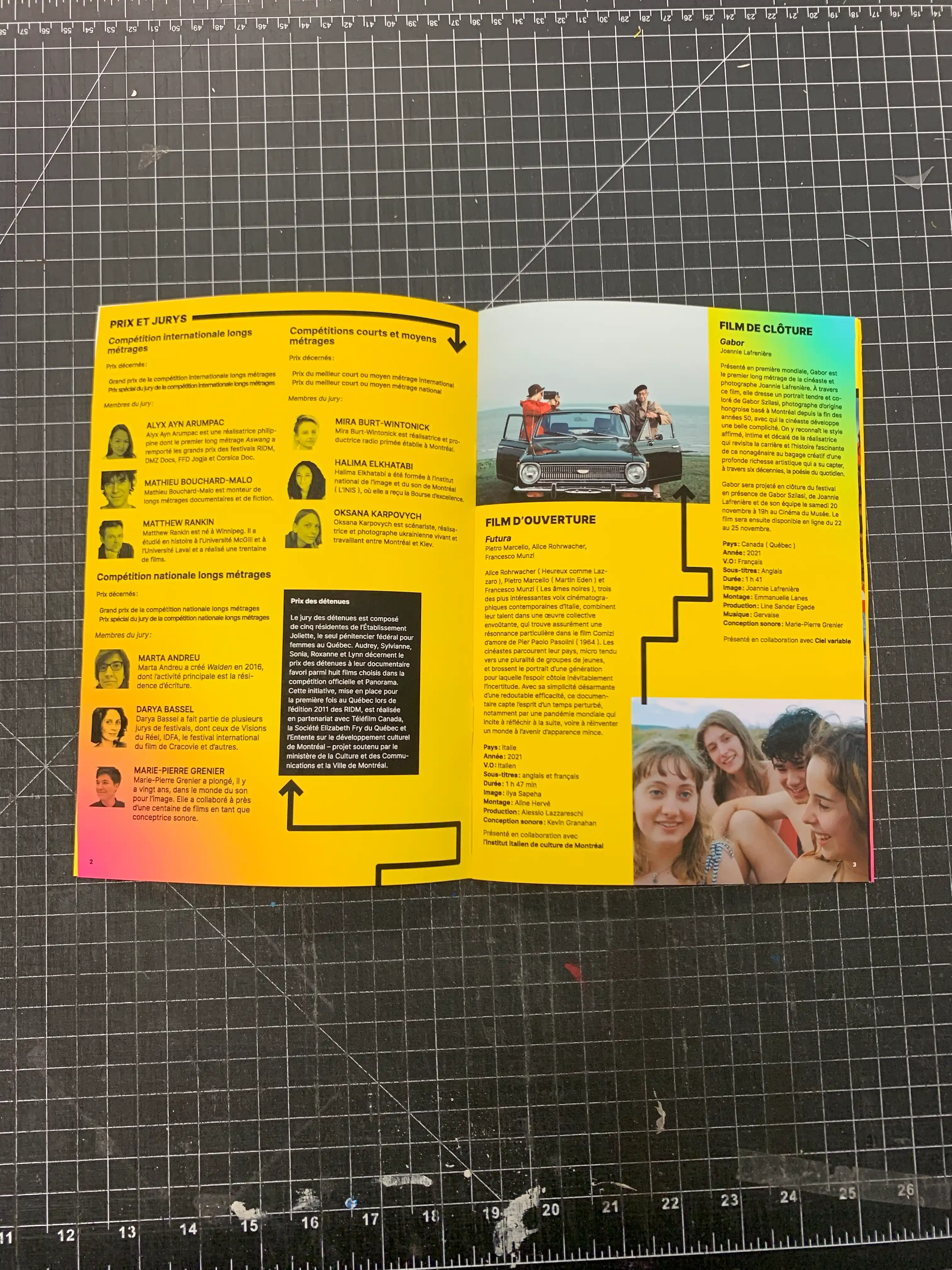
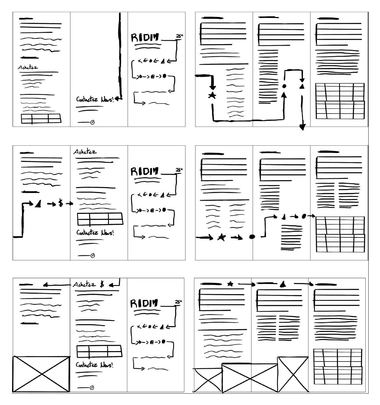
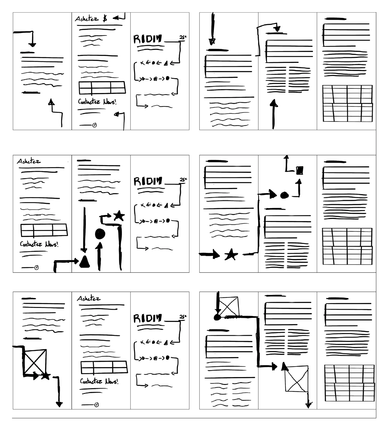
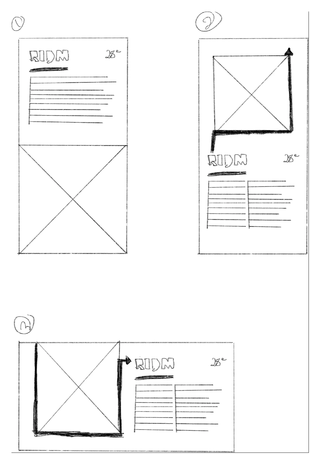
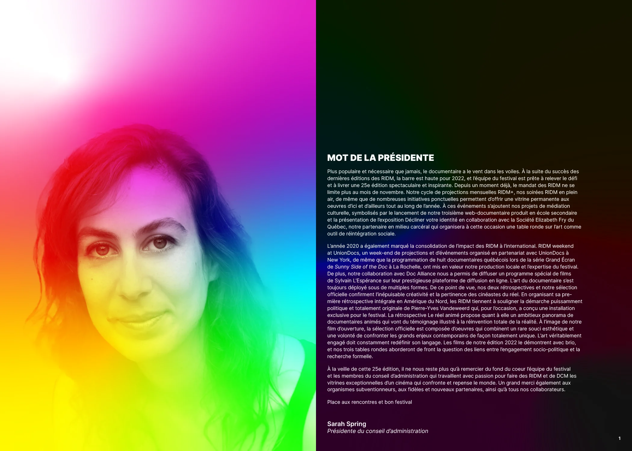
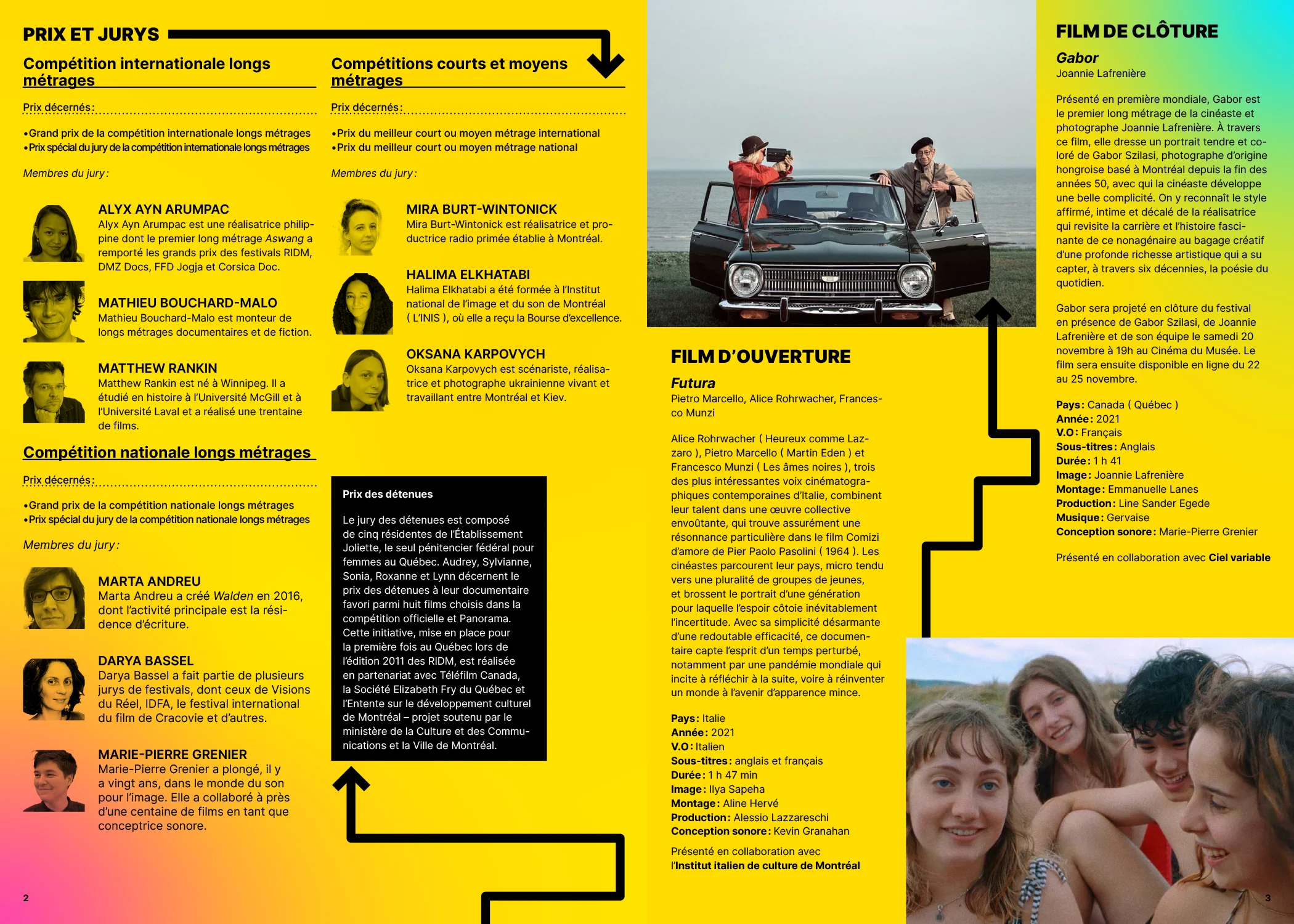
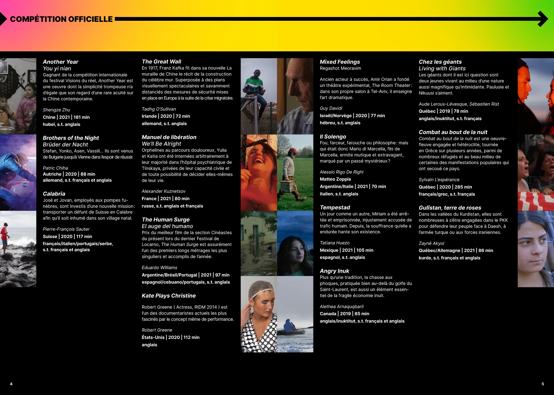
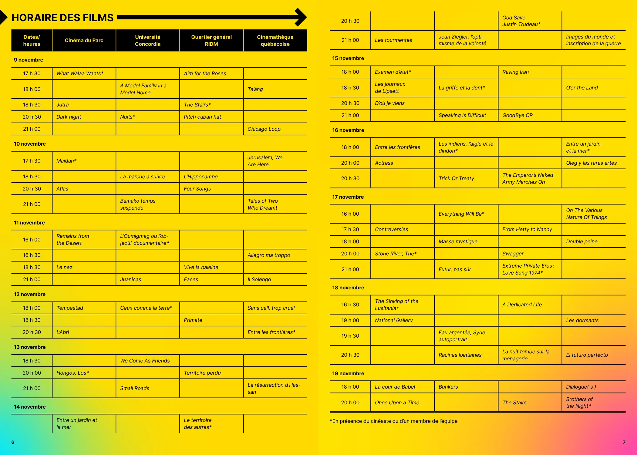
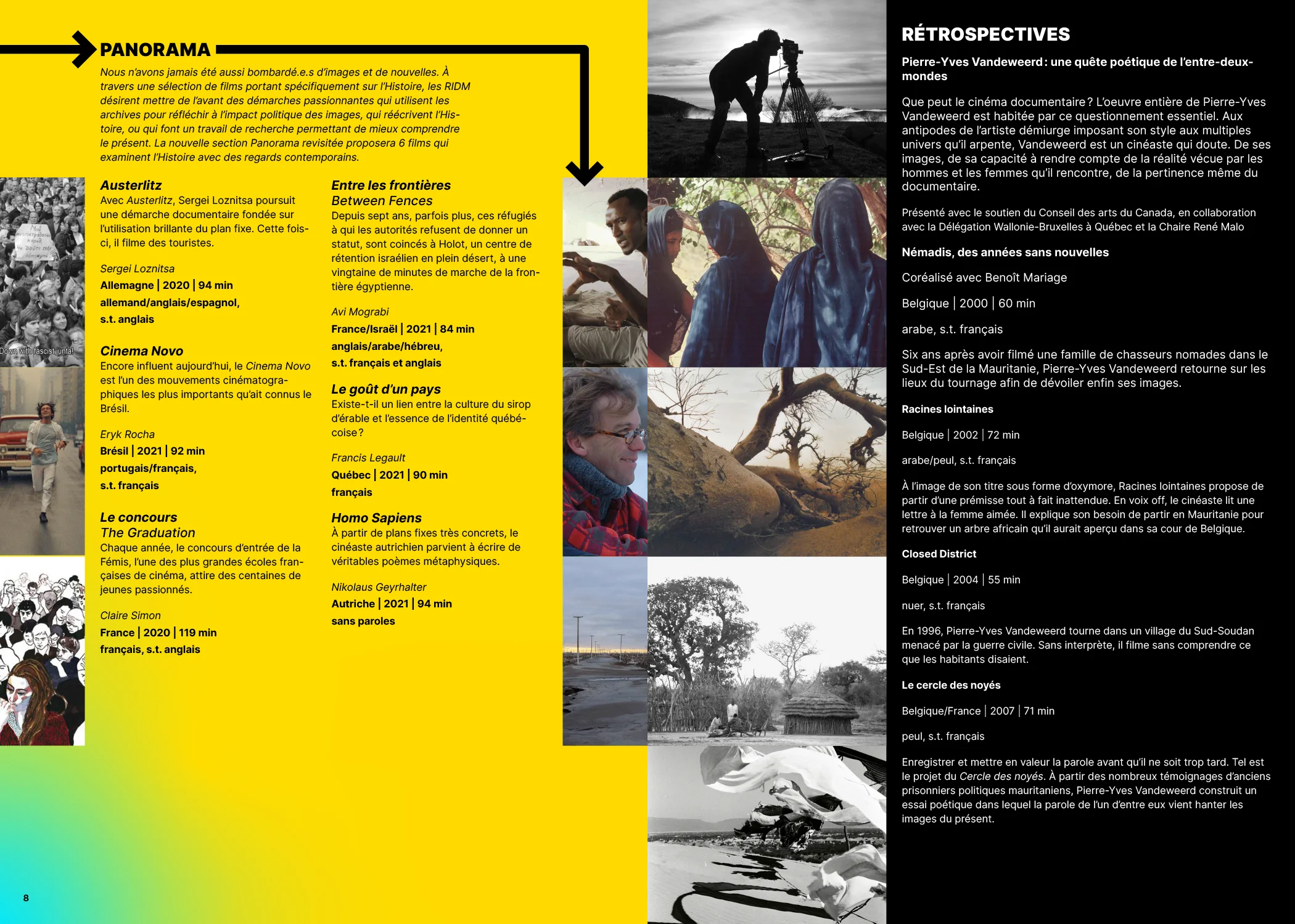
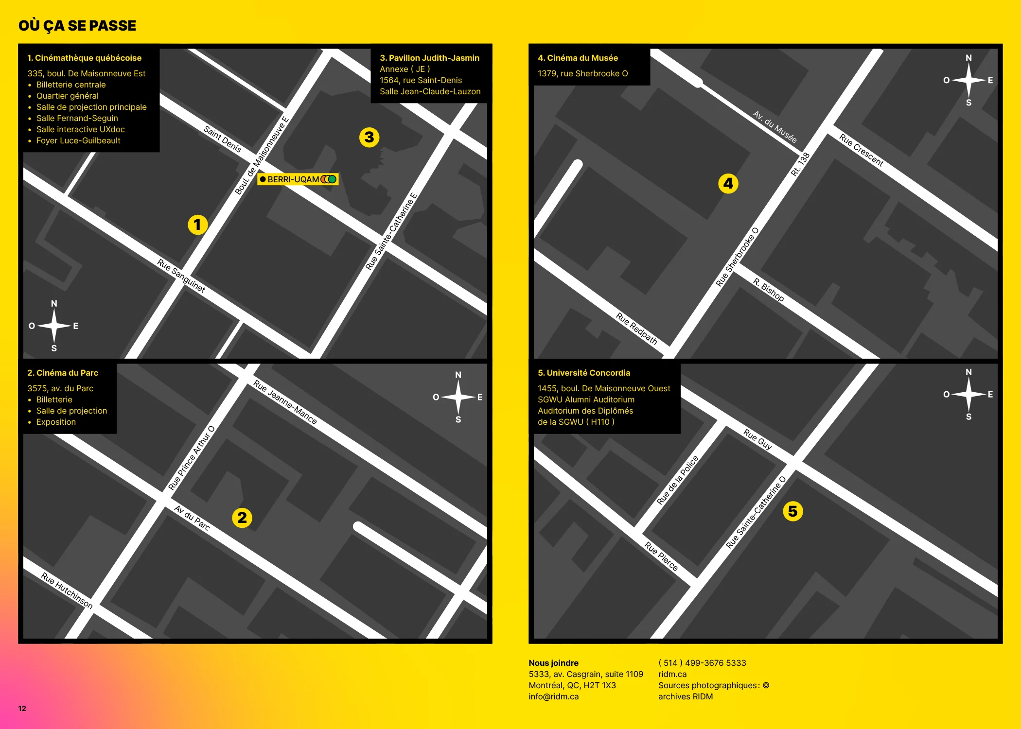
I was tasked with creating a program for the festival, including information about the diverse films presented, time table, informations on where to locate the different festival venues and more.

Final Products
Here are the final leaflets, posters and products created for the event.
